
NXNE App
An interactive experience for attendees of the NXNE music festival
My role
Designing the nav bar, profile pages and artist page
Team
Camille Gordon
Chun-Wei, Ke
Hannah Quintos
Jesal Rathore
Namita Dholakia
Shreya Malhotra
Timeframe
7 weeks
Skills
user experience design, content strategy,
Summary
North By North East approached the students at Humber College with a challenge to create an app that would encourage participants to engage with both the vendors and the musical acts while they were on-site at the event. Our team was tasked with creating a directory of businesses and venues. The navigation was broken into the following categories: music, activities, shopping and restaurants. We were given seven weeks to brainstorm, research, and design this app for NXNE. Here's what we had to solve: How might we develop an app that would encourage users to navigate the directory of businesses and venues?
Final Design

Challenges
1.Driving the incentive for engagement- we faced a challenge in figuring out how to encourage users to visit vendors and musical acts. How would we reward them for each one they visited?
2. Vendor & Artist promotion without overwhelming users- With so many artists and vendors wanting to be placed prominently, how can we balance organic discovery through maps and recommendations, and paid placements?
3. Navigation for crowded interfaces- with hundreds of acts and vendors within the festival, how can we streamline the interface so it’s simple enough to use in a noisy and crowded setting.
Metrics
Metrics for this app would include total downloads vs. Active users. Session length, sessions per user (how many times the users opened the app during the festival), and feature usage rates.
Background
Festivals have overwhelming schedules, and users might want to be able to custom create their own personal schedule so they don’t feel lost with all the vendors and acts competing for their attention. Poor wayfinding can also be an issue with festival maps being hard to zoom in on and not updated to accommodate changes. Festivals have become a consumer trend, and there is a lack of feedback for vendors & artists, where they can see how many people saw their profile, walked past their booth or engaged digitally. An app like this could collect data & analytics that would allow event organizers to track crowd flow, and potentially make a link between app engagement and food sales, merch purchases or show attendance.
We created an app design where users could create profiles that listed their music interests, and upload pictures of themselves. Users would be encouraged to engage with the artists by visiting their pages to view their showtimes, which are accessible within the app. Users would be able to create their own list of shows that they wanted to attend without the times conflicting by clicking the calendar icon to add it to their schedule. On the home screen, there would be prompts to encourage users to explore the restaurants in the area, and a map was built into the toolbar so that users could know where they are in relation to other attractions at all times.
Use Cases/ Design Research Synthesis:
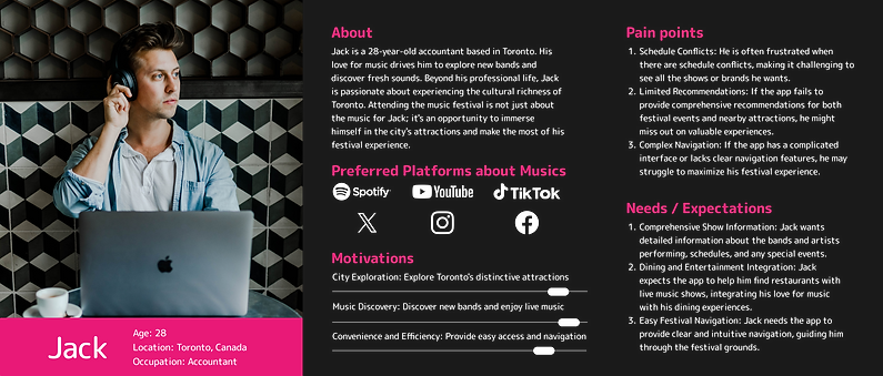
In this Discovery stage, our team conducted research to better understand the users and what would motivate them to use the app. We created an information architecture and user persona to highlight the key attributes of our users.
The pain points were as follows:
-
Schedule Conflicts: when the shows he wants have overlapping times and he can’t see them all or know which ones to see first
-
Limited recommendations: if the app fails to provide comprehensive recommendations he might miss out on valuable experiences
-
Complex navigation: If the app has a complicated interface or lacks clear navigation features, he might struggle to maximize his festival experience
The key descriptors include: sharing, engaging, community, cultural mosaic, immersive, sensorial bliss, energy.
Features Include:
1.Directory of businesses and venues (Something like campus compass - map and directions)
2. Accessibility features (audio directions), voice enabled and symbols [zoom feature]
3. Schedule of the festival
Waiting time level (how much time need to wait for this show? Is it crowded?)
Plan and customize your schedule by adding shows and shops and food venues
Sync contacts ahead of time to plan your day with others by sharing your schedule with friends
Have filter options to build your itinerary
3. Map - shows 2 views, both you are here within a large view of the map, as well as a navigation to view the route to your desired destination.
Save locations ahead of time as pins to visit and build onto a route.
Map generates suggestions of places close by show venues to visit after you populate your schedule with artist shows
4. Account (show the points of the game and personal information, festival Ticket or pass)
5.’More on this Artist’ button - Artist spotlight- get to know your artist ( song previews, photos, fun facts, etc)
virtual meet and greet with the facility of save a photo and share with friends on socials
Person who visits the most venues gets a swag bag at random - incentive
To better understand our user, we first created a User Persona.
Then, we followed up with an Information Architecture to understand the layout of the app.
.png)
This is the moodboard we created to get a feel for the design of the app.
.png)
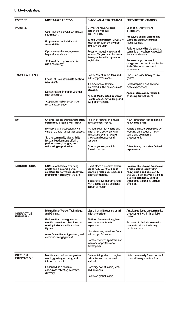
Competitive Analysis
Competitors included the Canadian Music Festival and Prepare the Ground. We compared their website, target audience, unique selling proposition, artistic focus, interactive elements and cultural integration.
Explorations
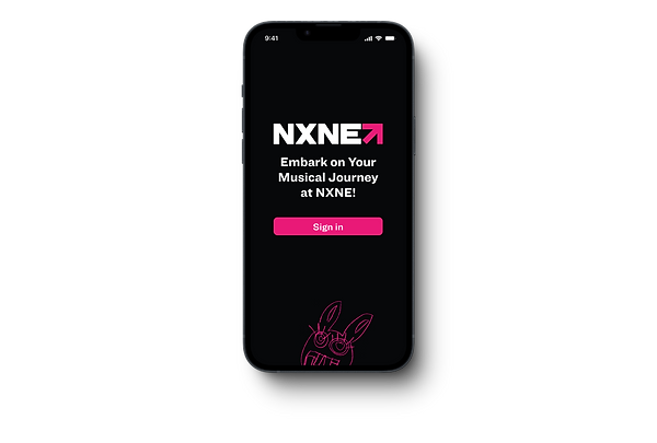
For the Nav bar, I explored ways to integrate the NXNE bunny they used as a logo. Initially we started with a smily face in the centre for the Game button, and we swapped it out for the bunny face within a circle. To make it stand out, we had the bunny ears poking out from the navigation bar and overlaying on top of the screen. For an added step, we wanted to prototype the bunny ears to move when pressed, adding an additional interactive element. Carrying the NXNE mascot iconography further, we used the outline of the bunny’s face as the profile picture frame, giving every user bunny ears.

Wireframing
Each team mate owned a separate page on the mobile interface. We worked on each screen and used the icon style and colours indicated by our style guide.


.png)
Final UI Design
We created an app where users could create profiles that listed their music interests, and upload pictures of themselves. Users would be encouraged to engage with the artists by visiting their pages to view their showtimes, which are accessible within the app. Users would be able to create their own list of shows that they wanted to attend without the times conflicting by clicking the calendar icon to add it to their schedule. On the home screen, there would be prompts to encourage users to explore the restaurants in the area, and a map was built into the toolbar so that users could know where they are in relation to other attractions at all times.


Reflection
Designing this festival engagement app has revealed several important learnings about the unique needs of attendees, vendors, and event organizers. Through our exploration of the problem space, we identified that discovery, real-time engagement, and data feedback are the most underserved areas in existing festival and vendor apps. Users often struggle to find relevant experiences amidst overwhelming schedules, vendors lack ways to incentivize the audience to engage with them in meaningful ways.
Our wireframes addressed these pain points by focusing on intuitive navigation, personalized recommendations, and a custom schedule creator.
Next Steps:
The next step would be to perform usability testing on the app we created to ensure it meets the goals we set out to achieve—improving discovery, facilitating meaningful vendor interactions, and providing organizers with valuable data. This will allow us to validate whether our navigation is intuitive under festival conditions, and whether our incentive structures truly drive vendor and artist engagement.
In parallel, we will work on creating micro-interactions that enhance the user’s experience, especially on the website and within the app. These subtle animations and feedback cues—such as map pin highlights, interactive schedule filters, and “wish list” confirmations—can guide user attention, provide reassurance, and make the overall experience more delightful without overwhelming the user.
By grounding these next steps in the insights we’ve gained, we can ensure that our design not only looks appealing but also functions effectively in the high-energy, high-noise environment of a festival like NXNE.